18 November 2012

Wow

I appear to have undergone one of those momentary lapses you hear people talking about where, for example, you get into your car and you start driving and then BOOM you're parked in front of your house and you've no idea how the hell you got there. I mean, sure, you can figure out that you must have driven but there's a gap in your memory and it's a touch concerning.

That's how I feel about this year. It's middling along in August, then, completely unexpectedly, it's mid-November. Woof! How time flies when you're doing essentially the same stuff every day, every week. My netball skills have vastly improved this year, but concurrently my fingers have been brutalized. Thanks co-ed netball! I also write rhyming couplets in my head now to distract me from customers who make me annoyed. Here is an example:
sorry but brooke fraser doesn't want your babies
when you smile like that it looks like rabies  
 Anyway, I've made a bunch of stuff (better than my customer complaint couplets) that I intend to put on here soon. Just a note to say that I still exist! Heh.

L

19 August 2012

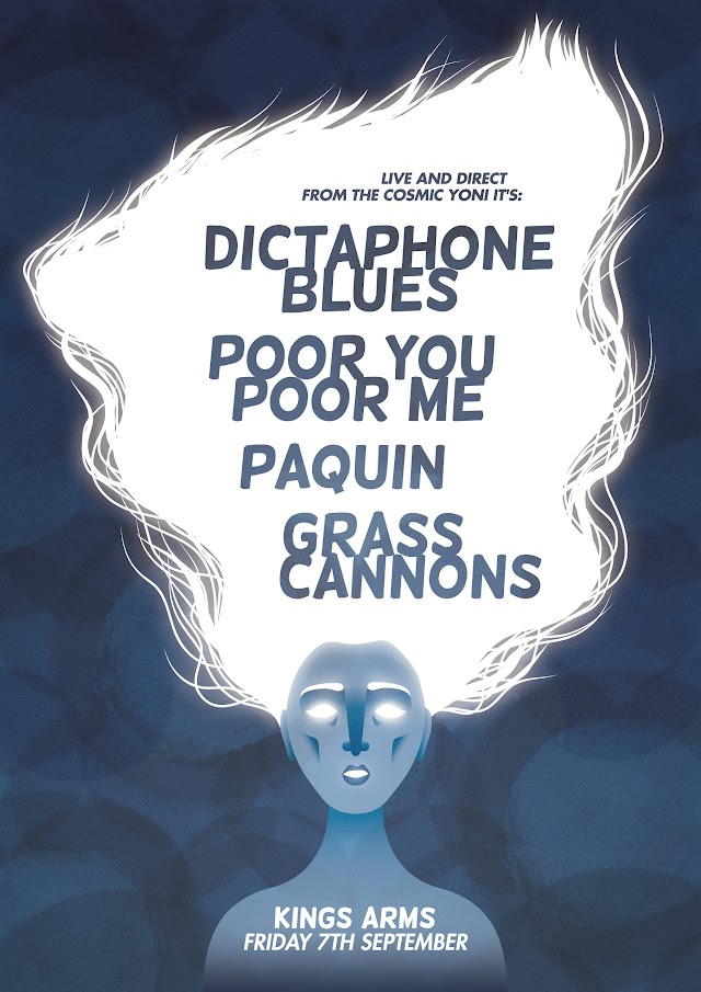
Some posters!


I love having friends in bands who contact me and say "any chance you want to whip me up a poster asap?" For the record, the answer will almost always be yes.


22 June 2012

Queerest Wine and Cheese Evening Poster

As the designer for OUSA is away on holiday at the moment, I've been doing some bits and bobs for them. This was heaps of fun to make. Such a cheesy couple right? Heh.

21 June 2012

Pecha Kucha for Puaka Matariki Poster

Oh yup, I made this too!

Dunedin Midwinter Carnival poster - process

I got asked to make the poster for this year's Dunedin Midwinter Carnival. It's a great event that I've been going to for years to enjoy the festive atmosphere, great lanterns, talented performers, and (above all else) the faces of adorable awestruck kids. I was pretty chuffed to get the chance to contribute to it.

I started off with a concept of a kid exhaling a big cloud of breath - luckily the festival director was down with that so I started off sketching it out a couple of times before moving onto the computer and drawing it up, then refining it.

We decided the kid looked a bit frumpy in their baggy old sweatpants and sweatshirt, so I gave them a makeover making the kid look a bit sleeker and more cosmopolitan. Bam.


The next part was deciding whether or not to include Jack Frost in the breath cloud or not. The festival director really wanted me to put Jack in (as the carnival's theme this year is "A Frosty Night" and the two main stilt walkers are going to be Jack Frost and the Snow Queen) so I drew up a couple of options. There was a fair bit of to and fro on this part.


In the end though, they decided to go with my original concept of the kid on their own. I didn't have to think too hard about font choices as they'd asked me to use the display font that has been used for all their promotional material for the past few years, and I decided on Gotham Rounded for the other text as it's a nice family friendly kind of face. So yeah! That's how the final poster came into existence - I also made a poster for the lantern making workshops which I've popped in for you to have a look at too.


If you're in Dunedin, this is on tomorrow night! Good fun times.

17 May 2012

The Eversons - Summer Feeling


In case you haven't already heard of this band of dudes, let me introduce you to The Eversons. Four guys based in Wellington making sweet indie pop together - I recognised Mark from his old band Little Pictures who have played here in Dunedin at (the now defunct) Arc with Blink's (now defunct) Low Hum Tours years ago, and also played at the first couple of CALH where I recall they did a sweet, sweet cover of Buddy Holly by Weezer.

In any case, I fucking love their album. It's like it was written for people in their late 20s with B.A.s living in New Zealand. It's like they have been facebook stalking my wall for the past four years. It's like they know me maaaaaan. From insecurities about the best part of our lives being over, to never finding that special someone to settle down with, to the constant feeling that everything cool is happening someplace outside of NZ (damn you Melbourne), to the realisation that perhaps that B.A. in Design and Theatre Studies wasn't the best thing I could have done with my life... these guys nail each and every topic with witty lyrics and catchy melodies.

One of my favourite songs from the album is Creepy. In my early twenties, this could have been a song about my obsessive crushes. Here is a video of The Eversons performing Creepy at the BFM sessions for your viewing pleasure.

- You can stream or buy the whole of Summer Feeling online here. It's a steal, it's a deal!

25 March 2012

Griping about album packaging design

Working in a music store, I see all kinds of album packaging coming through - from insane amounts of packaging with specially embossed slipcases, through to single cardboard sleeves. In the past few years my ideas about what constitutes good album packaging have crystallised from just knowing what I liked aesthetically, to knowing what WORKS.

Firstly, there are some conventions of packaging an album that I don't think should be broken for numerous reasons, mainly to do with the ability for a store to sell the album well. Sure, we can have the argument that most bands no longer rely on record stores as the main means of selling their music, but if a musician is planning on selling any of their albums in a store, here are some things to consider:

The shape of your packaging: if your CD case can't fit into the store's display shelves/racks/bins, then most likely your case will end up in some dusty corner, badly displayed. It astonishes me that so many artists don't see the logic of making their packaging fit within industry standard guidelines.

The visibility of your spine: sure if you've got a best-selling CD your case is going to be front and centre face out prominently on display, but even the most popular CD is eventually relegated to the bins. This means that your best bet of having someone pull your music out of the masses of other music is to make the spine wide enough to be seen AND to put your name and the title of your CD on the spine. Simple right? The best way a band can avoid this issue, is to make sure that they never release their music in a single pocket cardboard sleeve. Those suckers never have a visible spine and they look like shit. Fact.

Get a Barcode or a CAT number: again, this is simple stuff - if you can't be arsed registering your album for a barcode, get a catalogue number (either from the company distributing your music, or if you're distributing it yourself, just make something up) and place it on both the album and the disc itself. "Oh but Luci!" I hear you cry, "We're self-published! Why would we need a catalogue number?" Well dear reader, it's because a lot of record stores separate the disc from the case - if the disc and the case have a catalogue number, it makes it easy to be sure you are putting the right disc in the right case. This is especially important if either the disc or the case doesn't have your band name and your album title on it.
Which brings me to my next point.

Unless you are mega-super-famous, don't be a tosser; put your name and your album title on the cover. It doesn't have to scream your name, it just has to whisper it at the very least. If that's too cliché for you, at the very least, sticker your cases so that the information is there when it's being displayed.

Finally, and this is one I'm a bit more forgiving about, seriously consider whether you go cardboard over plastic cases. I know plastic cases are worse for the environment and also cost a bit more, but cardboard cases fall apart really easily and they don't protect your music half as well especially if you've got a set-up where the discs need to be pushed and pulled in and out of a tight wee pouch without the protection of  a paper sleeve. Think about how vinyl is packaged - LPs are usually put into a paper slip before they're slammed into the cardboard sleeves. Protection first! A nice solution to look into is the digipak format: having a cardboard outer with a glued in plastic CD tray (like this one,this one, or even this one).

Also, if you are getting cardboard sleeves printed for your album, talk to the printers about the kind of card stock they recommend you use. If you print on certain stocks, when folding and scoring the card into your case, the card will crack and tear the printed image. Printers know which stocks hold up to being brutally folded and scored and are more than happy to share their knowledge. Ask them!

It pays to remember that with the advent of digitized music downloads, if someone is wanting to buy a physical copy of your music, they probably are buying it for the aesthetic delights the packaging holds/nostalgia and ergo they will want it to last - both the physical packaging and the disc itself.

That's about it - what do you think? Do you disagree with me? Or are there other things that bug you about music packaging?

18 March 2012

Dunedin Fringe Festival

On Friday night after a long day being trialled at a possible new workplace, DJ and I went to check out Concrete Chimera - an exhibition co-curated by two very talented Dunedin photographers: Emily Hlavac Green and Alex Lovell-Smith. It was a double-barrel of sweet art works, my favourite being the fabulous kaleidoscope (which I think was by Justin Spiers? Correct me if I'm wrong) that I got kind of obsessive over. It had such a nice feel to it when you turned the crank! The exhibition is running until the 23rd, so I suggest you go and have a peruse.

In any case, while there we ran into some friends who had spare tickets to a show at the Fortune called Fickle Finger of Fate by the Kallo Collective.

IT WAS PHENOMENAL! Both of the performers were brilliant but I can't deny that the second performance by Thom Monckton was my favourite. His physicality was mind-blowingly good, like Mr Bean but without the cringe factor. Sadly, they only did three shows and all of them have now been. Luckily, you can see a bit of his solo piece here:


Finally, I made a poster for the Pecha Kucha night that was part of the Fringe but due to being a nana and somehow sleeping through the whole weekend, I missed it. Sigh.


25 February 2012

For the Quail


So Evan Sunley James from For the Quail asked me if I could make them a gig poster this weekend and I said "YES PLEASE" and here it is! Man. I really love making posters (hint hint)

Mark and Miri get hitched!


I was asked to take photos at a lovely wedding in Queenstown a few weekends ago between two really lovely people, Mark and Miriam. Only it wasn't really in Queenstown, it was at the entrance to the Routeburn walking track where the bride and groom both worked at the time that they met. Meaningful AND stunning. Perfect really.


It was a beautiful day and Mark and Miri were an absolute pleasure to take photos of given how amazingly radiant and happy they both looked. Their first dance was one of the sweetest things I have ever borne witness to. I hope they have a long and enjoyable life together.


- if you want, you can check out a heap more that I took on my flickr account

25 January 2012

New camera lens! Huzzah!


So I decided that I wanted to update my camera gear but I didn't have the cash to buy a new camera body so instead I bought a new lens! The cheapest lens around really, but it's pretty fun so far! Also happy about DJ beginning to get his beard back. Yuss.

22 January 2012

Dingding

It is a true story that Ding is one of the coolest cats around. I spend a lot of my time when I'm not at work trying to convince him to hang out with me and then feeling blissfully chuffed when he does, worried when he won't come home, and annoyed/amused when he attacks me.

I also like that in summer and in winter he looks like a totally different cat - in summer he's sleek and shiny and in winter he's got the puffiest ruffs and breeches around town.

We've got an awesome relationship. I can't wait until winter so that I can hang the birdfeeder outside the window again and watch him try to catch them despite the glass in his way.

14 January 2012

Happy New Year

Ahoy Brave Reader! I can't believe you're still here! So sorry for keeping you waiting all this time.

A million million apologies for my crapness at posting last year. As it turns out, this is something I seem to do annually - start the year off strongly with a flurry of posts only to have the activity die off over the course of the year.

In 2012 I plan to be much more creative. Good plan hey! In order to implement this bold plan, I'm going to be cutting down on how often I work at Marbecks to four days a week instead of five. Scary stuff. I think I wrangle it though - do some freelance work, make some art, paint my house. Good things to be doing.

I don't want to just post about stuff that I've designed, I also want to post about stuff that's going on in my life. If this turns you off, fair enough, not everyone is into hearing about my cat and how angry customers make me. Seriously though, people need to learn a little thing called respect. Also how to be polite. I encounter so many assholes on a daily basis and they manifest in so many different ways that it blows my mind. What really surprised me was how the worst ones are the older ones who have such a sense of entitlement that they believe throwing their credit card and purchase at you while talking on the phone and not looking at you is a perfectly acceptable form of interaction to have with another person. Yeesh. Give me one of our crazies any day - at least they know how to say please.

Anyway, this was just to say I intend to be on here more often posting about more kinds of stuff and I hope you stick around!

Luci