08 August 2011
Derby!
A friend of mine is a derby dame and was asked to take a whack at redrawing/tidying up their logo. She was tearing her hair out about it so I offered to help. I don't know if they're even going to use it (I think they're a bit uncertain about the direction they'd like their "brand" to head in and I gave it to them about a month and a half ago) but it was pretty fun to make so I thought I'd put it up on here.
Cellists of Otago
Months ago a lovely lady called Judy came into our store to ask if she could hang a poster up, I said sure, and she handed me the poster. It was... ok. I had some time on my hands and told her that I was a designer and that if she'd like me to put together a new poster for them, then I could do it in an afternoon for them for free (not my usual approach but she was so nice and the poster was so... ok). She agreed delightedly and I gave her my email address.
Later I went round to her house and photographed her lovely old cello, sparred with her ferocious kitty on the couch, (there is nothing I like more than teasing and then trying to sooth a ferocious cat - live life dangerously) chatted with her husband George, then headed home to put it together.
I made it simple so that they could reuse it again and again by just changing the text on the left hand side. Judy was delighted. They had very positive feedback on the poster and swore that the audience was larger than usual. They gave me a cute little card with a wee dog on it and a lovely thank you note and a cheque (which was not at all neccessary but nonetheless very kind).
I'm glad I offered my services to them on a whim - it felt good helping them out with a new poster and in a month I'm going to photograph the whole group of cellists which should be some good experience (I don't think I've ever tried to photograph more than 5 people together at a time...).
Matt Langley + Darren Watson
Below is an even earlier idea that I made for them that fell through - might end up using it again later for someone else... watch this space and all that jazz! This was the first time in a long time that my initial concept was rejected by a band - something I'm putting down to the fact that I tend to make posters for bands who I know both personally and musically, and in this instance I didn't know them well enough to begin with (not that they're not nice guys, they are - I just didn't "get" the vibe/aesthetic/genre bang on first try).
You live you learn.
04 July 2011
Michael Gillette
Dude ought to know what he's talking about here - he is an awesome illustrator responsible for the coolest James Bond book covers I've ever seen. Check out his work at here and here.
15 June 2011
The wants of a leggy blonde
As someone who stand 6'1, shopping for tights to wrap around my pins has long been a pain in the butt. Or mid thigh if I'm honest, because 90% of the hosiery that I've purchased in my life result in the gusset of the tights hanging out in between my thighs and refusing to stay near my crotch like some fearful gay man...
I have friends who are at least a head shorter than me who buy x-tall tights and find that they're just right. Gah!
Well, finally I seem to have found a brand that gets that the X stands for extra and have made tights that are actually EXTRA TALL. Long live Voodoo! They're my new hosiery heroes - not only are they long enough to cover the full length of my leg, they have tights that don't sit at the hip, instead sitting much higher around the waist.
The firm control ones pictured above, are AMAZING. Getting into them made me feel like Winnie-the-Pooh trying to get out of Rabbit's burrow after over-indulgin in honey. Quite a squeeze. But once on, glorious snug fitting, firm-holding goodness.
Love.
25 April 2011
Open email regarding Annabel Fay's Leg
(This email was originally sent to the photographer, Olivia Hemus, and the designer of the album, Indium Design, that the above picture fronts.I didn't get a reply sadly, and I'd quite like one.)
Hi!
My name is Luci and I work in at a record store in Dunedin and studied design at Otago putting me in a somewhat unique position where I'm interested in both music and design and ever since the promotional poster for Annabel Fay's new album arrived in store and was unfurled on the wall, and then when the album itself arrived in store, I've been dying to find out whether she is, in fact, an amputee.
Can you help me? Is there actually a second leg hiding behind her front leg due to an amazing feat of foreshortening/lighting/camera angle/bendy knee syndrome? Is she an amputee who wears a fake leg most of the time but decided bravely to reveal her amputee status to the world on her new album (new album, new start)? Or, dare I ask, was it an editing decision to remove that unsightly, un-called for second leg? Who needs two of them anyway.
This has been making me crazy for ages. I emailed EMI but no-one could give me the truth! The truth! I figure between the photographer and the designer credited in the liner notes, one of you can help me out. I promise, I shall take the truth to my grave if needs be, but this is an itch that must be scratched for the sake of my mental wellbeing.
Much obliged,
Luci
28 February 2011
Go font yourself
At last! A quiz that answers that age old question, "if I were a typeface, which would I be?"
Turns out, I'm Architype Van Doesburg, because apparently I'm Emotional, Assertive, Progressive, and Disciplined (lol). This is the 6th most common result out of 16 typefaces.
What are you? I really want to see if anyone comes out as Expanded Antique - such a minority!
Turns out, I'm Architype Van Doesburg, because apparently I'm Emotional, Assertive, Progressive, and Disciplined (lol). This is the 6th most common result out of 16 typefaces.
What are you? I really want to see if anyone comes out as Expanded Antique - such a minority!
18 January 2011
Happy Nude Year
Woohoo! 2011 eh!
From henceforth 2010 shall be referred to as my Lost Year. The equation below explains it quite clearly: homeownership + hilarious cat + full-time work + loss of dedicated "creative time" = an exhausted non-productive hermit who emerges only for netball and when emotionally blackmailed. Yuss.
So no more! My one resolution for 2011 is to not let it be a repeat of 2010.
Thus far, January has proved promising - I've got a couple of interesting design projects on the horizon, my mum bought me a beautiful old sewing machine for my birthday which just needs a new cog before it's all mine, I've been drawing a lot more, and with the addition of an iphone as part of my anatomy (because it's now a permanent fixture on my body) I've been taking lots of photos and getting into observing and composing images again. I'm posting them at http://otherwiseforgettablemoments.tumblr.com if you want to check them out anytime.
So in the spirit of this being a new year with new creative endeavors, check out these posters!
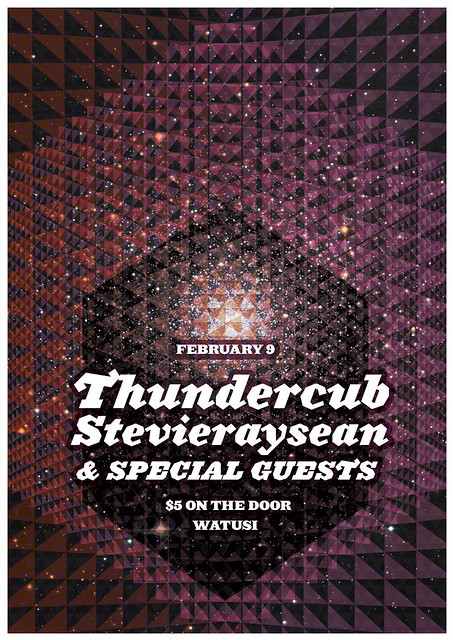
I put this one together last night for Thundercub. Fun times!
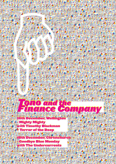
This one is one I did for Tono in December. Wanted to see if I could make an interesting poster using Wing Dings. Mission accomplished?
From henceforth 2010 shall be referred to as my Lost Year. The equation below explains it quite clearly: homeownership + hilarious cat + full-time work + loss of dedicated "creative time" = an exhausted non-productive hermit who emerges only for netball and when emotionally blackmailed. Yuss.
So no more! My one resolution for 2011 is to not let it be a repeat of 2010.
Thus far, January has proved promising - I've got a couple of interesting design projects on the horizon, my mum bought me a beautiful old sewing machine for my birthday which just needs a new cog before it's all mine, I've been drawing a lot more, and with the addition of an iphone as part of my anatomy (because it's now a permanent fixture on my body) I've been taking lots of photos and getting into observing and composing images again. I'm posting them at http://otherwiseforgettablemoments.tumblr.com if you want to check them out anytime.
So in the spirit of this being a new year with new creative endeavors, check out these posters!
I put this one together last night for Thundercub. Fun times!

This one is one I did for Tono in December. Wanted to see if I could make an interesting poster using Wing Dings. Mission accomplished?

Subscribe to:
Posts (Atom)


